Innovating and Investment Platform:
Making journeys more efficient and design modern
As the Lead UX/UI Designer, I had the privilege of leading an innovative project at a renowned investment company with a history of more than 37 years in the financial sector, with the challenge of modernizing a system and an app developed in 2016, which no longer met the expectations of contemporary users.
Context
About the project
made in 2022
Time frame
10 weeks
Team
Lead UX/UI Designer (me)
UX Researcher
Ui Designer
Tools
Miro
Figma
Azure DevOps
Teams
Powerpoint
Desafios e Oportunidades
My task, along with the team, consisted of deeply immersing ourselves in the various user journeys, identifying, through detailed analysis, the critical points that urgently needed innovation, and then directing our efforts to redefine the investment journey. Our goal was to create a more modern and fluid experience, always in close collaboration with clients to validate our solutions, all under the pressure of a challenging deadline of just 10 weeks.
To meet these challenges and seize opportunities for growth and improvement, we focused our initiatives on the following areas:
Making the investment journey simpler and more intuitive.
Enhancing the perception of modernity and reliability of the platform.
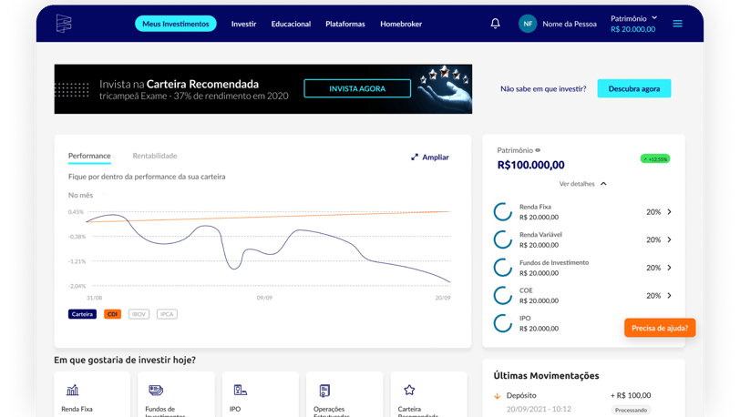
Making the homepage more intuitive and functional for users.
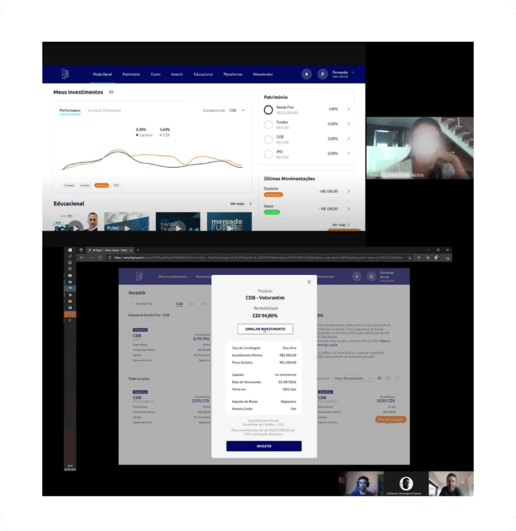
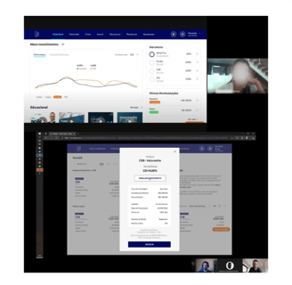
Allowing users to view their earnings in a clear and detailed manner.
Facilitating the withdrawal operation for users, making it quicker and less complex.
Results
2x faster
to make investments suggested by the platform
Modern Visual
increasing in reliability through visual modernity
More practicle
for viewign earnings and operations
Mapped Layout
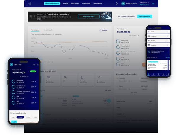
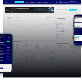
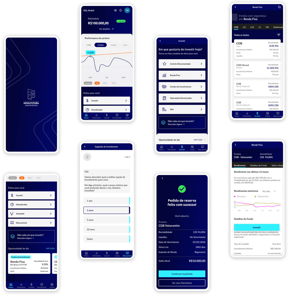
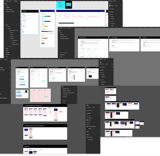
The development of desktop and mobile interface prototypes validated by real users. With an enhanced user experience, a modern and simplified design, easier viewing of earnings, and a quick and efficient withdrawal process.
A platform with a more modern look and more efficient journeys
Our Solution

Execution Strategy
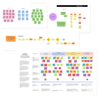
As the Lead UX Designer, I played a central role in the strategy and execution of all project tasks, developing a roadmap with objectives, tasks, deadlines, and deliverables, in order to maintain clear and effective communication with both stakeholders and the team.
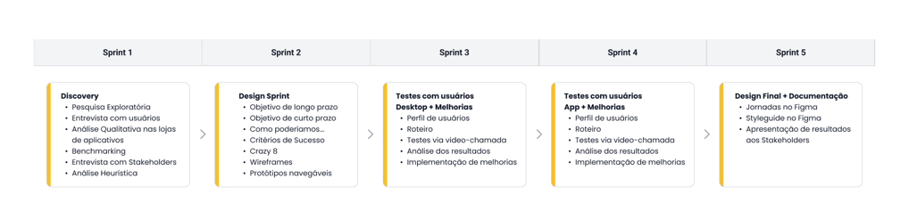
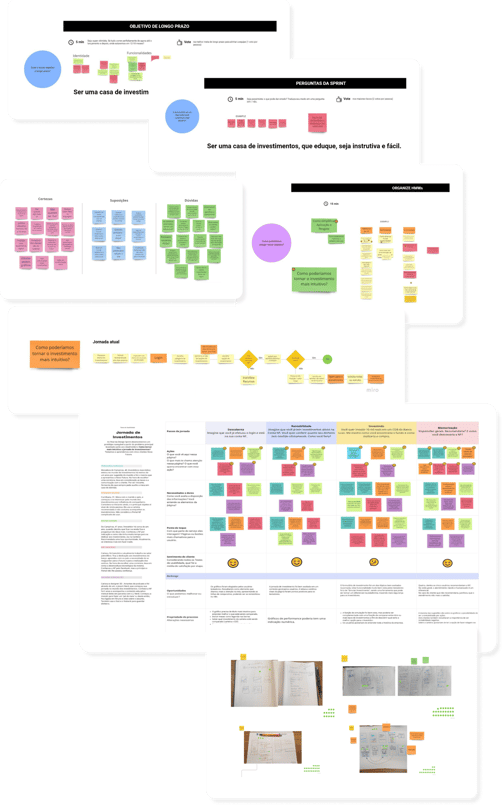
Discovery
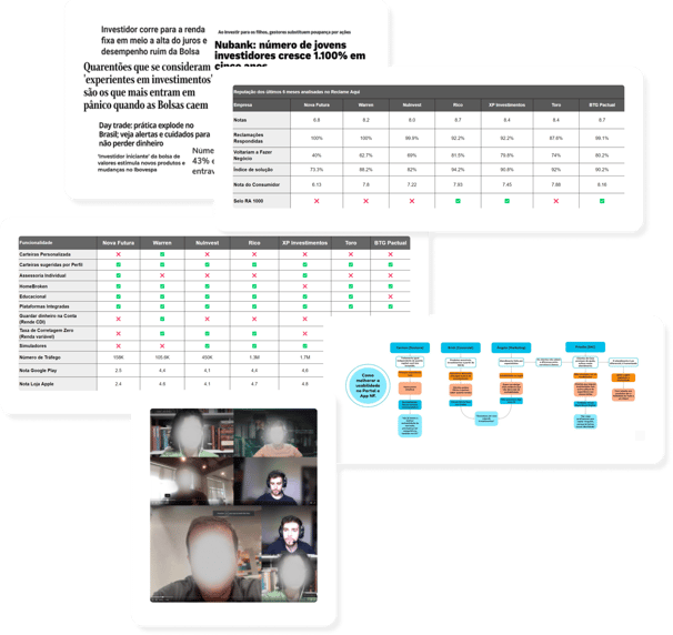
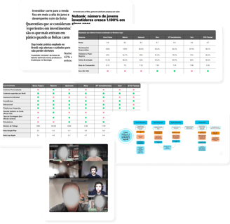
In the Discovery phase, we delved deeply into the financial market universe to enhance our understanding of the business and user needs, seeking an empathetic connection with both. We explored the financial market using primary sources of information, collecting data on the profiles of current and emerging users, as well as conducting a qualitative survey in the AppStore and PlayStore and on ReclameAqui to identify the main complaints of the Investment Company's clients.
To deepen our understanding of customer expectations regarding functionalities and experiences, we conducted a detailed benchmarking of the main competitors, also aiming to understand their competitive advantages.
With the goal of putting ourselves even more in our users' shoes, we conducted a thorough usability analysis of the investment platform, focusing on the interface and the end-user experience.
We engaged stakeholders through targeted interviews to capture the main difficulties faced by the business and the most common user complaints.
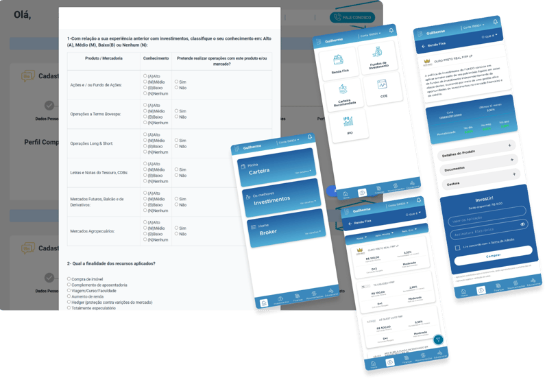
We selected 5 representative users from each investor profile for interviews, assigning them the task of making a fixed income investment from the journey to be updated. This process allowed us to quantify the time spent and identify the main frictions in the investment journey.
In preparation for the second week, I communicated to the Stakeholders about the days, times, and preparations for conducting the Design Sprint in Sprint 2.
Em preparação para a segunda semana, comuniquei aos Stakeholders sobre os dias e horários e preparativos para a condução da Design Sprint na Sprint 2.
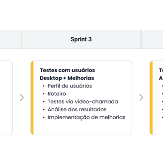
Design Sprint
During the Design Sprint, I acted as the facilitator of the dynamics, bringing ideas to the table and mediating decisions to ensure their impartiality. I was responsible for leading crucial discussions and achieving fundamental consensus for the success of the project, addressing topics such as short and long-term goals, formulating "How might we" for the chosen investment journey, success criteria, brainstorming for the ideation of the perfect investment journey, and the development of wireframes.
In collaboration with the user interface (UI) designer, I created high-fidelity and interactive prototypes, focused on the selected journey, to be tested with real users.
Testes and Iterations
During the third and fourth sprints, we conducted 12 qualitative interviews with users to capture their impressions of the layout and user experience. To expand our database, we also carried out 50 tests using the automated Maze platform.
We assessed success at 75% based on the time and number of frictions in task completion in both applied methods, observed positive feedback and few doubts, in addition to an average journey completion time of 4 minutes, which was previously approximately 8 minutes, due to usability and platform infrastructure issues.
Key learnings
Changes in colors and the month filter in the charts were positively highlighted.
Comparative profitability between assets and company information aided in the investment decision.
The modernized visual brought greater reliability to the testers.
Some comments from interviewed clients
“Ter informações da empresa é muito bom. Normalmente eu pesquisaria isso no Google, mas que bom que já tá aqui”
Rafael, 30.
“O site está bem transparente e tem as informações que uma pessoa que faz investimentos quer saber, como, o quanto o dinheiro dela rendeu em detalhes”
Deise, 43.
“Senti mais segurança. Acho que pelo novo design e por também não ter travado em nenhum momento”
Augusto, 37.
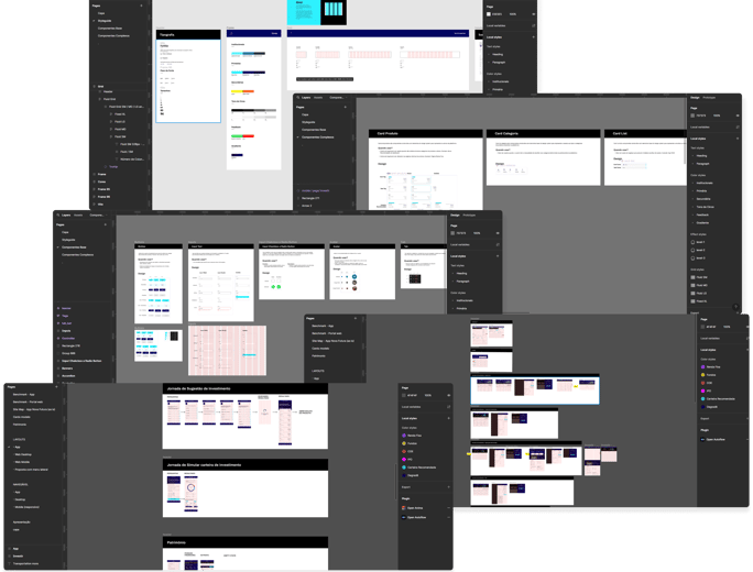
Documentation in Figma
In collaboration with the UI designer, we compiled and presented the technical documentation to the engineering team. Representing the team, I led the final presentation of the project and its results to the stakeholders, highlighting the progress and learnings obtained.
The final documentation was prepared in Figma, containing a Styleguide, color specifications, typographies, grids, core and complex components, also with guidelines for the engineering team on the journey.
Conclusion and Learnings
The completed project was a milestone of success, with positive results presented to stakeholders. This experience provided significant personal and professional development, especially in negotiation and communication skills, converting the initial skepticism of some stakeholders into confidence in the Design process. The journey reinforced the importance of effective communication and adaptability, contributing to my growth and reaffirming my commitment to excellence.
© Mauricio Garcia Munhoz 2024
Made with ♥ in Brazil